Wednesday 11 May 2011

CD cover and interior


This is the front of my groups CD cover


This is the interior of my CD cover


Evaluation


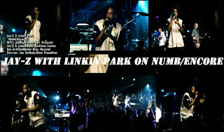
Before we embarked on this project we were all given the task of going out and researching a pop promo that had already been released and to go and look at and review a few music videos. I chose to look at Jay-z and Linkin Parks jointly produced album collision course; I chose to do this partly because Linkin park remind me slightly of the band that we worked with (Distraction) due to the fact the band had such a diverse background of musical influences, but mainly because it was a hugely successful album and so i choose to work from the best example possible.


When making our video the group did have some creative differences between each other, one member wanted to make more of the love scenes, whilst i wanted to include more of the band. I wanted to do it like this because i think we chose a very simple easy narrative to follow that didn't warrant massive chunks of the video's time. I thought it would be a better idea if we made more use of the band; for example i came up with an idea to just get some shots of the band messing around and wanted to include more in the finished piece but the idea was turned down. Looking at the video now i think the correct decision was made at the time for the video, as the narrative is much stronger.


Friday 6 May 2011

Treatment for music video

Distractions PerformanceOur band Distraction will be the main feature throughout the music video despite our dark romantic narrative; our aim is to promote the band. We will be filming in the college music room just next door to the recording studio where the band creates their magic. The room was quite cramped for a performance however I thought that it would work well as it would show the authentic "beginning" that Distraction had at SNC. It will be quite simple to fit them all in a camera shot together but we will do several run throughs of the band performing their song "Let the Sun Shine" The focus will be on the band as a whole but I think we should add a little extra focus to the main singer because his voice dominates the track. CUs and mid-shots of each performer, using at least 3 long shots from different points and angles in the room in order to capture the bands performance as a whole. I may pull some focus away from the bass players in the music videos final edit as there are 2-3 of them; the melody they create supports the song perfectly so I will not make their presence completely unknown. Going through several takes of the song and each time focusing on different performers i.e. drums, lead guitar, pianist etc. We will hand the camera to Distraction and let them mess around with it in order to capture them away from strangers and it will go well with the tech shots to create a compilation of the recording studio. We will also use a B&W effect on their performance in order to blend them in with the narrative.The NarrativeWe will start of with some long shots to establish both the male character and the setting, also I think it will help the audience notice the B&W effect in the narrative. An interesting low-angle shot of the male charater on the balcony of the atrium as it portrays him looming over the other students yet he is powerless, make the brightness and contrast a bit deeper to show his dark mood; possibly noticeable to audience. The computer screen effect would be perfect to give artificial light to the dark surroundings - CU, reaction shot to computers failed search of his identity. The hallways of the media department are usually deserted in lesson hours so it will be perfect to film part of the narrative there which will help further separate our tortured male character from the rest of the world, I was hoping to film an additional scene featuring Distraction - a long shot to show them kicking out the male character from the band making him an outcast and giving him some origin in the narrative however it seems unlikely and I think Distraction are not the narrative type of band. In order to shed some light onto the narrative I think it will be interesting to move the setting outdoors yet still keeping it in B&W which will help with the lightening of the mood when the male will notice the female character and then the romance genre will come into play. Filming Charlotte will consist of a few long shots; introducing her to the narrative as a random student, the camera will pan horizontally when she walks. A quick jump cut, CU reaction shot of the male noticing her. A point of view shot watching her as she walks past him without noticing his gaze. After the elongated chorus performance by Distraction will lead to the introduction of the meet cue between the two characters causing the lust to become mutual, CUs of the eyes and hands as we will do the traditional scene of teenagers meeting in school. The RED effect will be used to symbolise the love in order to do this we will use red clothing/accessory items. A few more scenes like the meet cue will eventually lead to the final shot of the male and female character together which will be the perfect final shot, possibly fade to black.

(credit to George D.L)

promotion for the digipak: Jay-z and Linkin park


Due to the fact that this digipak was produced and made by two separate musical entities; Linkin park and Jay-z there isn't very much in the way of promotional material, most of the promotion work was done by MTV.


MTV mash-ups is what brought the two together so they handled the promotion by using their network of channels to advertise it, and using a TV channel as popular as MTV has an effect.


Whilst all the promotion for the link up was happening the picture on the left was an image you couldn't turn on MTV without seeing, it was used in adverts, on the website etc. I think that the imagery and font used is very representative of both jay-z and the band mixing the urban and the grime of both respectively.


I think that when making this print ad the boys have gone for a very simplistic feel, this helps to add to the mystery of the joining of the two music giants. This then in turn intrigues fans of either or both to go and watch the show or buy the album.


My point is further backed up by the fact that hardly any information is given on the ad apart from where to buy tickets, it doesn't even announce a support act.


I think that the use of only three colours makes the little information that is on show bold and stand out to the viewer. Both Jay-z and Linkin park are so massive in their respective genres that they don't need their actual images to promote or help people recognise them, so the use of the shadow's is a very stylistic effect.

Tuesday 5 April 2011

Ideas for band logo



This was my 1st idea for the band logo and probably the one i like the best out of the three. I think it shows the band it the light that would need to be shown in if properly promoted. Even though they are a pop band there are certainly elements of rock and also a slight feel of the emo genre due to the look and style of some of the band members. I think the red and black theme in the logo gives them a slightly unknown mysterious feel.


This is my second attempt at a band logo, this time i went for more of a fun feel to the logo. I think shows more of the boys real life personalities. I think the yellow helps to represent the name of the song aswell (sunshine). The font i chose was particularly smart and "proper", i think this would help to give the band an air of importance. The red on yellow stands; this helps show the fact that they arent just another pop/rock band.

This was my last idea and also the one i liked the least, when i was making it i chose to give it a slighty gothic, mystical feel. After finishing the idea i decided that this wasnt the sort of direction that i thought was right for this band.

Lyrics for Sunshine by Labrinth and distraction version

I feel a cold flush going through my hair and hey you know what I don't even careThe time has passed me by Its gone with the wind Its all because the sun shined once again Now the party's on Everybody's there And if you don't know anyone You'll still meet some new friends That's the way it is When i have myself a drink All because the sun shines once again Let the sunshine Let the sunshine baby Let it all go Let it all go baby Let the sunshine Let the sunshine baby Let it all go Let it all go baby so turn the lights offaint no one afraid when the night comes it’ll be just like the day and without the day i am glowing from within only cus the sun shined once again so play that sweet tuneplay it through the air and the volume blaze it up dont you ask me twice you know i’m gonna bid only cus the sun shined once again let the sun shine let the sun shine baby let it all go let it all go baby let the sun shine let the sun shine baby let it all go let it all go baby i know that the world is gonna smile again when we go from the darkness into the light ohhhlet the sun shine let the sun shine let the sun shine let the sun shine baby let it all go let it all go baby let the sun shine let the sun shine baby let it all go let it all go baby (x2) let the sun shine yeah eh eyy yeah

Feedback for our music video

Here is the Feedback for our music video given to use by our Teacher and our Classmates on Friday 25th March 2011. We all watched "Let the Sun Shine" and other peoples music videos with other bands in which we all exchanged opinions and praise. The feedback were based around the questions below. Does the Music Video work with the Song Lyrics/Music? "Yes, i think its an excellent representation of a lost person finally finding a reason to live again" "I think the song is lovely, how it is transformed from club music to a melody with meaning and heart" "A nice relaxed feel to it and the band are well suited to the music video" "The Bass players need more screen time in the music video i think" "I love your reactions, George!" Anything to suggest? "Need a final shot of the two main characters together" "Maybe its a bit too dark?" "I would have like to have seen a wider range of locations in the Music Video" "Bit of a polish with more Wide Shots" "Would like to see more of the Larkin' Around" "Either need more of the flashing light effect or none at all" "Interested to see a CD cover" "Maybe a bit more colour for the sunshine, making it more dominant" Representation? "Calm band, relates to The Red Hot Chilli Peppers" "Indie, anti-superstar representation of the band" "Slightly Charty" "Similar to Nickelback, Blink-182 or Kings of Leon (the band)" What did you like in the Music Video? Editing & Creativity? "The Black and White works very well in the music video" "It's great being up close to the lead singer during the chorus" "The RED effect is very nice, a good representation of romance in a B&W video" "I like the darker contrast effect" "The pace and mood is brilliant, easy to follow and keeps with the speed of the music" "Narrative works quite well" (compiled by George Duric-Last)

Friday 1 April 2011

Digipak- Jay-z and linkin park collision course


Collision course is a cd/dvd digipak released by rap legend jay-z and rock giants Linkin park. Released on november 30th 2004, the album was classed as an EP due to the short length of the CD; being only 21:18 minutes and 6 tracks long. The album sold 1,934,000 just in America and over 5 million worldwide.

The DVD in the digipak contained behind the scenes footage of jay-z and the band and 5 scenes from a live preformance.

Band member Mike Shinoda revealed in his 2004 acceptance speech at the grammy's that he would be working with Jay-Z for a project under MTV's Mash Ups show. MTV allowed Jay-Z to choose a group or artist for the mash-up to make the show with. Jay contacted the group, who began experimenting with mixing the tracks before sending some examples to him. As a result, Jay-Z began working personally with Shinoda by email. The two decided that instead of combining the existing tracks for the live performance on MTV, they wanted to re-work and re-record parts of the songs to make them fit better. Shinoda asked his bandmates to re-record instrumental and vocal tracks, whilst jay-z rerecorded lyrics so they worked better with the new tracks; ultimately both parties decided they wanted to release the studio tracks.

As the both music acts involved in the project are both household names there was no real massive ad campaign for the album. It has been known as a bit off a side project for both parties involved, but jay-z and the band both done interviews (especially for MTV) and let their fans know about the project.

The album's cover is typically Linkin Park, very grundgy and gritty using dark basic colours. Despite this the cover definatly has elements of the hip hop culture in featuring images of boom boxes and spraypaint effect visuals.


Locations, props and costumes

Locations-Recording Studio/Booth, Suffolk New College – This location will be used for a majority of the bands performance throughout the music video “Let the sun shine”The Learning Curve, Suffolk New College – 2nd scene that serves to the narrative where the main character is descending into darkness and his existence is fading. Google’s himself 0 results.College grounds, Suffolk New College – Important scene where the character sees his new love interest and the mood of the narrative becomes brighter and the stylistics change featuring more colours.Recording Studio/Booth, Suffolk New College – Flashback sequence of main characters dismissal from Distraction.Random Locations around SNC – These small 20-sec clips will brighten the mood continuously and will eventually blossom the relationship between the two main characters.Large music room, Suffolk New College – Final scene, boosted performance from Distraction featuring the same song, only a different setting. Closing sequence for relationship that has finally bloomed and is strong, Distraction is performing better and the main character does not need them anymore.

Props-Instruments mainly associated with the rock genre and featured in the song. Guitar/Bass, Drums/Symbol, Microphone etc.(Optional) Alcohol bottle, Lit cigarette in order to emphasise the depression the main character is encountering in early scenes.Windows PC, Keyboard used when the main character Google’s himself which will serve as a symbolic feature showing the fading of his existence.

Costumes-Black denim, Black jackets at the start to emphasise the dark mood and current state of the main character. (worn by the band, main character but different style)White T-shirts in order to represent the change of mood for the narrative. (worn by the band)(Optional) Red Jacket, Dress this will be used to create unique effects with Final Cut Pro be a reference to Sin City etc. (worn by the female main character)Casual Bright Clothes another change of style to go with the newly established lighter mood featured in the music video. (worn by both main characters) (list compiled by George D.L)

Storyboards


This my groups original set of storyboards, detailing the performance section and also the narrative. As you can probably tell from the images above we decided to differ from our story board using better and/or more feasible ideas where possible/needed.

Friday 25 March 2011

Audience profile: female


Female
· Slightly older teenager
· “Girly girl”
· Interested in pop and r’n’b
· Liked bands and musicians include; the wanted, JLS, Taio Cruz, N-Dubz and Michael Buble.
· Hobbies include things like; socializing with friends, reading celeb magazines, cinema and shopping.
· Works in retail or hairdressing.

Audience profile: male


Male
· A younger teenage boy 13-15
· Skater boy
· Interested in pop and soft rock
· Liked bands and musicians; Mcfly, sum41, blink 182, the wanted, example and Ed Sheeran.
· Hobbies include; skating, football, gaming, films and listening to musicWorks as a paper boy or waiter.

Friday 4 March 2011

Ideas for CD cover

Front image:


Back image:


I wanted to use a solar eclipse on the cover of the album including the bands logo, I chose this because it is such a strong powerful image; it also signifies something special but also powerful.

For the rear image I wanted to use a picture of one of the band making it look like he has the sun in his hands. I think this would show the band as powerful, and making the band member in the photo look especially important.


2nd Idea


Front:


Back:


For my second idea, I decided that I wanted to use more of the band on the cover, using an image of them running to make them look a bit more fun, its also a more eye catching option.

On the back of the CD cover I wanted to continue on the theme from the front of the CD, I liked the idea of them coming out the other side of the tunnel. I think this imagery signifies them getting through there struggle to make it and their trials and tribulations being over.

Friday 14 January 2011

Video effect test

In our video, for the performance sections we decided we wanted to use the pleasentville effect; an effect which removes the colour from a video apart from a selected colour, for example the effect used in Schindler's list. we done a couple of test shoots to test out the effect before using it on our project. The 1st test is above.

This was the second test we filmed using the pleasentville effect, as you can see in the video the effect didn't go as planned.

Project Brief

For my A2 Media project i was asked to produce a promotional package for a band. this package had to contain a video for a song off the album an two out of three of the following:

-A website for our band
-A cover for the album as part of a digipak
-A magazine advertisement as part of the digipak

My group of three consists of Me, George Duric-Last and Charlotte Clarke. Between us we chose to produce the album cover and the magazine advertisement. We were also asked to consider our intended audience whilst making our promo package.

To coincide with our work we are also making a blog to show our findings and our work etc.

Friday 7 January 2011

Individual idea for CD cover and poster


For the actual CD cover i thought it would be a good idea to use a simple cover which shows off the band and their image. I think that this would be a good idea due to the fact that the band would be realativly unknown even in the UK, so would be a perfect oppurtunity to show of their faces to the public (basically free advertising). whilst the aformentionted things will be covered, it will also give a very basic and stylistic look to the cover, so to not tie them down to a particular genre or look.